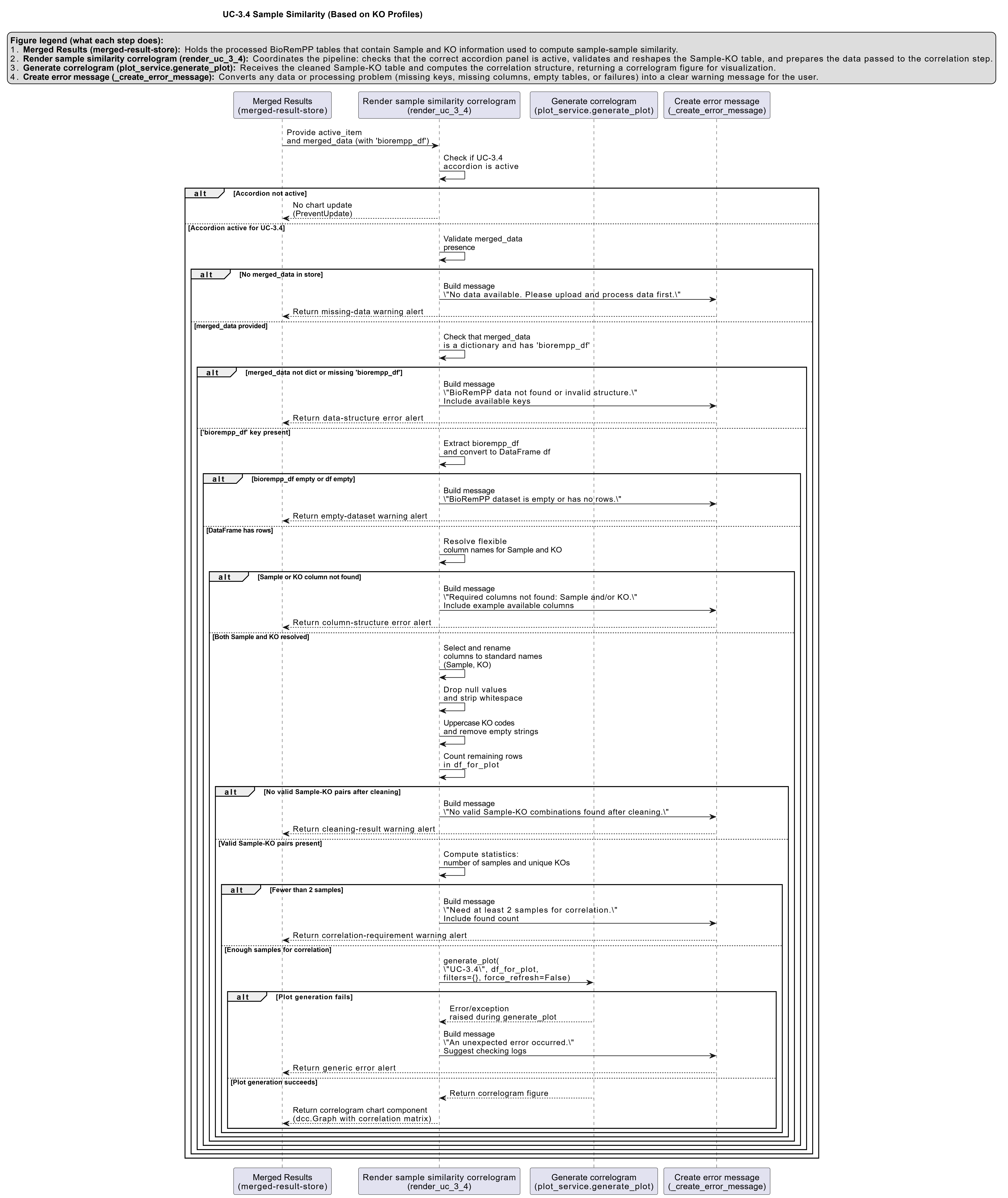
UC-3.4 — Sample Similarity (Based on KO Profiles)
Module: 3 – System Structure: Clustering, Similarity, and Co-occurrence
Visualization type: Correlogram (sample × sample similarity heatmap in KO space)
Primary inputs: BioRemPP results table with sample and ko columns
Primary outputs: Pairwise similarity matrix of samples based on KO presence/absence
Scientific Question and Rationale
Question: How similar are the samples to one another in terms of their shared KEGG Orthology (KO) annotation profiles?
This use case quantifies the pairwise KO annotation similarity between all biological samples using their KO annotation profiles. A correlogram (heatmap of a correlation matrix) is constructed from binary presence/absence KO profiles for each sample. The resulting visualization provides a compact, quantitative view of how similar any two samples are in terms of their KO co-annotation patterns, which can reveal coherent annotation-based groups, transitions, and outliers within the dataset.
Data and Inputs
- Primary data source:
BioRemPP_Results.xlsx or BioRemPP_Results.csv - Key columns:
sample– identifier for each biological sampleko– KEGG Orthology identifier associated with the sample- Accepted format: semicolon-delimited text table (
.txtor.csv) - Derived structure: binary presence/absence matrix with:
- rows = samples
- columns = unique KOs
- cell =
1if the sample possesses that KO,0otherwise
Analytical Workflow
-
Data Loading
The primary results table (BioRemPP_Results.xlsx or BioRemPP_Results.csv) is loaded into memory. -
Matrix Construction
A binary presence/absence matrix is constructed where: - rows correspond to Samples,
- columns correspond to unique KOs, and
-
each cell is
1if the sample possesses the KO and0otherwise. -
Correlation Calculation
A pairwise similarity matrix is computed by correlating the presence/absence vectors (rows) for every pair of samples. Typically: - the Pearson correlation coefficient is calculated between each pair of sample vectors,
-
this yields a square matrix where each cell
(i, j)represents the similarity score between Sample i and Sample j based on their KO profiles. -
Rendering
The resulting sample-by-sample correlation matrix is rendered as a heatmap (correlogram): - both axes list the same set of samples,
- cell colors encode correlation values, and
- a color bar indicates the numerical range of correlation coefficients.
How to Read the Plot
-
X-axis and Y-axis (Samples)
Both axes represent the same set of Samples. The cell at row i, column j shows the similarity between those two samples. -
Cell Color
The color at each cell encodes the correlation coefficient between the KO presence/absence profiles of the two samples: - higher positive correlation (stronger similarity) is shown by warmer or more intense colors,
-
lower correlation (weaker similarity) is shown by cooler or more neutral colors.
-
Color Scale
A diverging color scale is typically used: - warm colors (e.g., reds) indicate high positive similarity,
- neutral colors indicate intermediate similarity,
- cool colors (e.g., blues) indicate low or potentially negative correlation.
The main diagonal is always at the maximum value (correlation of a sample with itself).
Representative Output
The image below illustrates a representative output generated by this use case using the example dataset.
Click on the image to enlarge and explore details.
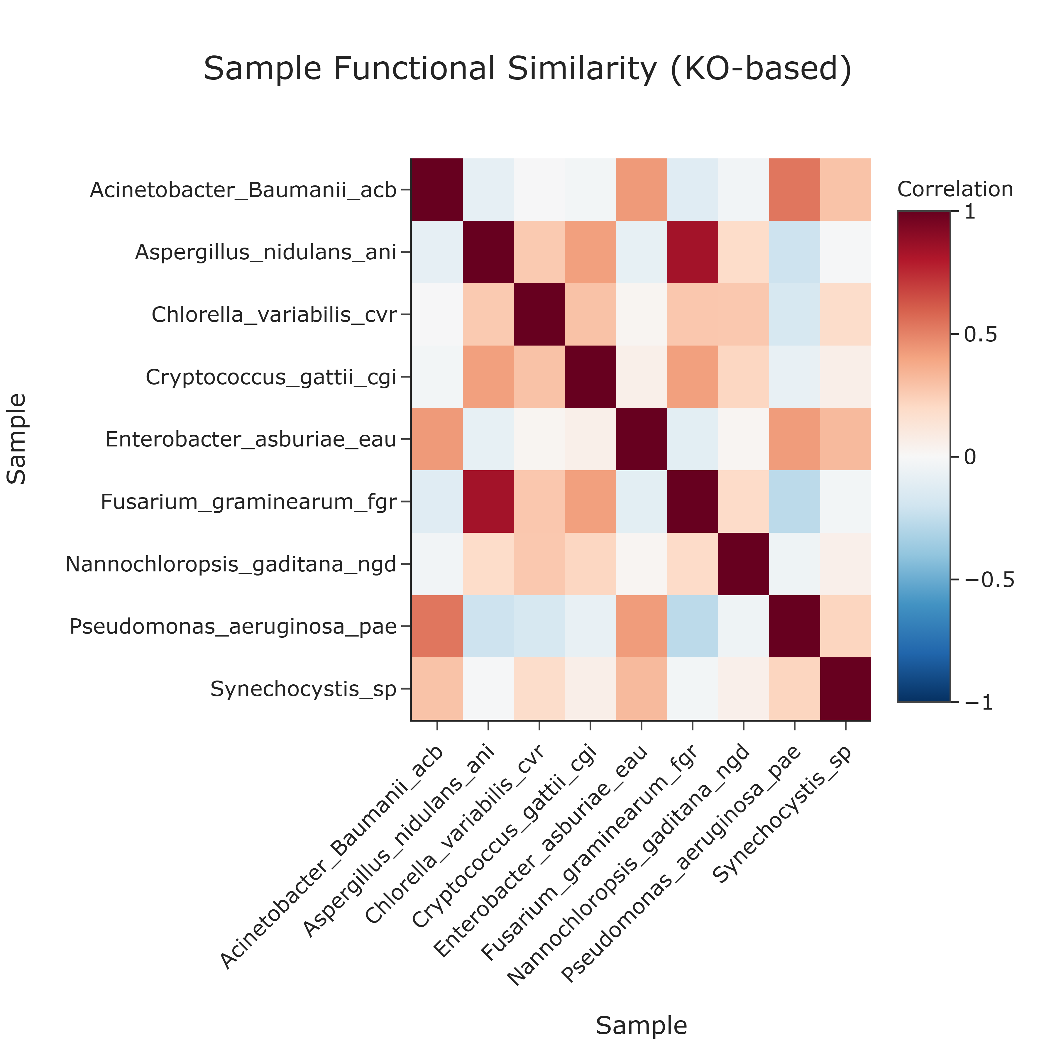
Interpretation and Key Messages
-
KO Annotation Clusters Blocks or patches of warm colors off the main diagonal may indicate clusters of samples with highly similar KO annotation profiles. Such clusters could correspond to samples sharing comparable KO annotation repertoires and may warrant joint investigation.
-
Distinct Annotation Groups The large-scale pattern of the heatmap can reveal annotation-based distinct groups:
- tight, warm-colored submatrices may signal sets of samples more similar to each other than to the rest,
-
boundaries between warm and cooler regions could suggest transitions between major annotation-based groups.
-
Unique Annotation Profiles Samples that show generally low similarity (cooler colors) across their row/column may have unique or distinct KO annotation profiles in the context of this dataset, making them potential candidates for focused investigation.
Reproducibility and Assumptions
-
Input Format
The analysis assumes a semicolon-delimited table containing at least the columnssampleandko. -
Binary Representation
The similarity calculation is based on binary presence/absence of KOs. Multiple occurrences of the same KO within a sample are collapsed into a single presence (1). -
Similarity Metric
The default similarity metric is the Pearson correlation coefficient applied to binary vectors, which measures the linear relationship between KO repertoires. While suitable for many use cases, alternative metrics (e.g., Jaccard similarity) may be considered in complementary analyses. -
Interpretation Scope The correlogram reflects similarity in KO annotation profiles, not expression levels, gene copy numbers, or kinetic parameters. These aspects require additional layers of experimental data and analysis beyond the presence/absence of KO identifiers.
Activity diagram of the use case
Click on the image to enlarge and explore details.