UC-3.5 — Sample Similarity (Based on Chemical Profiles)
Module: 3 – System Structure: Clustering, Similarity, and Co-occurrence
Visualization type: Correlogram (sample × sample similarity heatmap in compound space)
Primary inputs: BioRemPP results table with sample and compoundname columns
Primary outputs: Pairwise similarity matrix of samples based on compound interaction profiles
Scientific Question and Rationale
Question: How similar are the samples to one another, based on the shared repertoire of chemical compounds they are co-annotated with?
This use case quantifies pairwise similarity between all biological samples using their compound co-annotation profiles. A correlogram (heatmap of a correlation matrix) is constructed from binary presence/absence profiles of compounds for each sample. The resulting visualization provides a compact, quantitative overview of how similar any two samples are in terms of the compounds they are co-annotated with in the database, which can help identify annotation-based sample groups and unique annotation profiles within the dataset.
Data and Inputs
- Primary data source:
BioRemPP_Results.xlsx or BioRemPP_Results.csv - Key columns:
sample– identifier for each biological samplecompoundname– name (or identifier) of the chemical compound associated with the sample- Accepted format: semicolon-delimited text table (
.txtor.csv) - Derived structure: binary presence/absence matrix with:
- rows = samples
- columns = unique compound names
- cell =
1if the sample is associated with that compound,0otherwise
Analytical Workflow
-
Data Loading
The primary results table (BioRemPP_Results.xlsx or BioRemPP_Results.csv) is loaded into memory. -
Matrix Construction
A binary presence/absence matrix is constructed where: - rows correspond to Samples,
- columns correspond to unique compound names, and
-
each cell is
1if the sample is associated with that compound and0otherwise. -
Correlation Calculation
A pairwise similarity matrix is computed by correlating the compound presence/absence vectors (rows) for every pair of samples. Typically: - the Pearson correlation coefficient is calculated between each pair of sample vectors,
-
this yields a square matrix where each cell
(i, j)represents the similarity score between Sample i and Sample j based on their compound profiles. -
Rendering
The resulting sample-by-sample correlation matrix is rendered as a heatmap (correlogram): - both axes list the same set of samples,
- cell colors encode correlation values, and
- a color bar indicates the numerical range of correlation coefficients.
How to Read the Plot
-
X-axis and Y-axis (Samples)
Both axes represent the same set of Samples. The cell at row i, column j shows the similarity between those two samples. -
Cell Color The color at each cell encodes the correlation coefficient between the compound co-annotation profiles of the two samples:
- warm colors (e.g., reds) indicate high positive similarity (samples are co-annotated with very similar sets of compounds),
-
cooler or neutral colors indicate lower similarity.
-
Color Scale
A diverging color scale is typically used: - warm colors highlight strong similarity,
- neutral or cool colors indicate weaker similarity.
The main diagonal is always at the maximum value, as each sample is perfectly correlated with itself.
Representative Output
The image below illustrates a representative output generated by this use case using the example dataset.
Click on the image to enlarge and explore details.
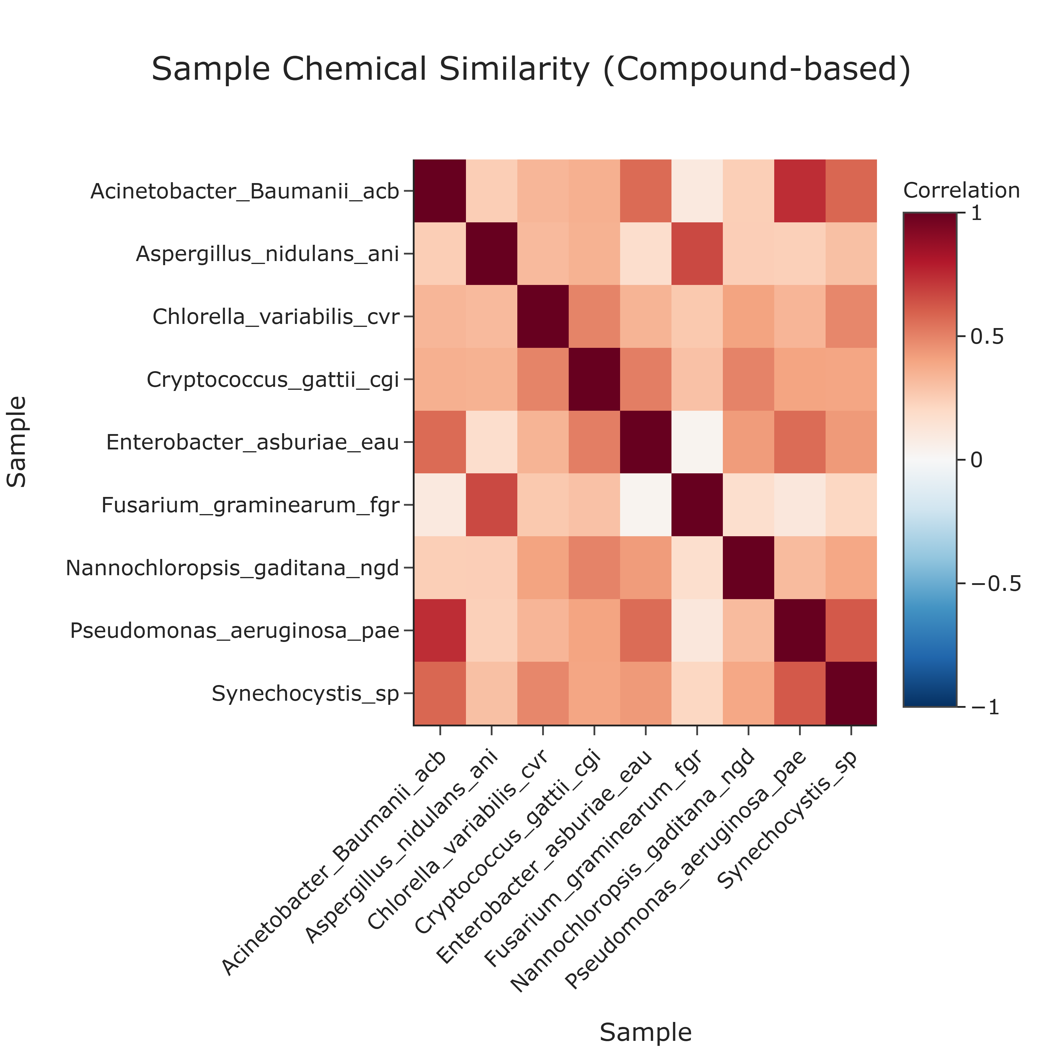
Interpretation and Key Messages
-
Compound Co-annotation Clusters Brightly colored blocks or patches off the main diagonal may identify clusters of samples with highly similar compound co-annotation profiles. These clusters represent groups of samples that share overlapping compound co-annotations in the database.
-
Distinct Annotation Groups The overall structure of the heatmap can reveal distinct groups of samples with different compound co-annotation patterns:
- separate warm-colored regions could indicate sets of samples primarily co-annotated with different compound subsets or classes,
-
transitions between regions may suggest differences in compound annotation coverage.
-
Unique Annotation Profiles Samples whose row/column is dominated by neutral or cool colors (low correlations with most other samples) may exhibit unique or rare compound co-annotation profiles within the dataset. These may warrant focused investigation.
Reproducibility and Assumptions
-
Input Format
The analysis assumes a semicolon-delimited table containing at least the columnssampleandcompoundname. -
Binary Representation
The similarity calculation is based on binary presence/absence of compounds. Multiple occurrences of the same compound for a given sample (e.g., through different genes or pathways) are collapsed into a single presence (1). -
Similarity Metric
Similarity is quantified using the Pearson correlation coefficient applied to binary vectors. This metric captures linear co-variation in compound repertoires; while widely used, alternative metrics (e.g., Jaccard similarity) may be explored in complementary analyses. -
Interpretation Scope The correlogram reflects similarity in compound co-annotation profiles, not interaction strength, kinetic efficiency, or environmental abundance of compounds. These aspects require additional experimental data and analyses beyond the presence/absence of
compoundname.
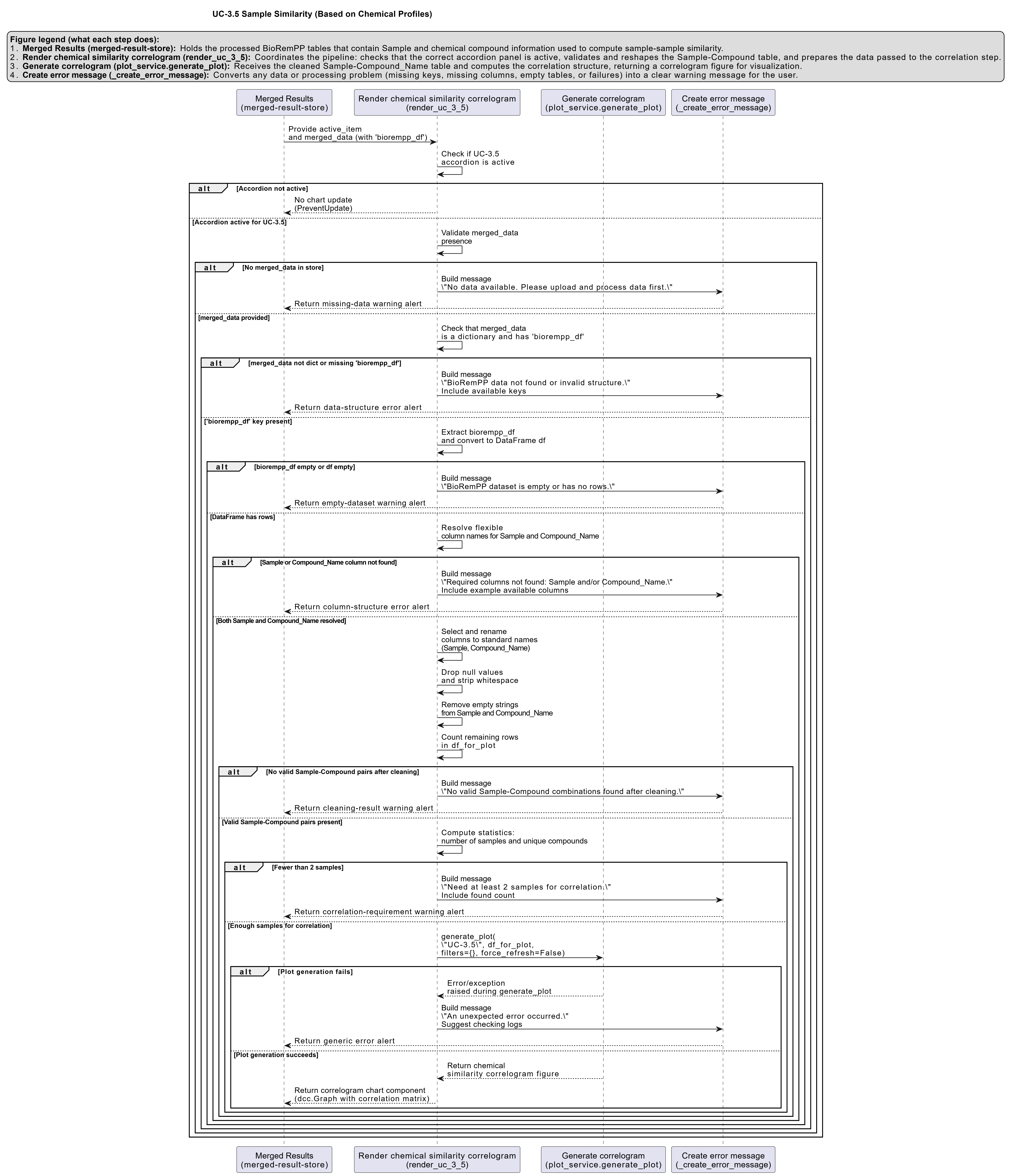
Activity diagram of the use case
Click on the image to enlarge and explore details.