UC-4.10 — Diversity of Enzymatic Activities Across Samples
Module: 4 – Functional and Genetic Profiling
Visualization type: Bubble chart (enzyme activity vs. genetic diversity across samples)
Primary inputs: BioRemPP_Results.xlsx or BioRemPP_Results.csv (sample–enzyme–gene associations)
Primary outputs: Matrix of enzyme activities by samples with gene-diversity "hotspots"
Scientific Question and Rationale
Question: Which enzymatic functions in which samples have the greatest diversity of unique gene annotations?
The same enzymatic activity can be annotated across multiple, non-identical genes. Quantifying the number of distinct gene symbols per enzyme activity per sample may reveal:
- which enzymatic activities have the broadest gene annotation coverage per sample, and
- how gene annotation diversity for enzymatic functions is distributed across samples.
Data and Inputs
-
Primary data source:
BioRemPP_Results.xlsx or BioRemPP_Results.csv(semicolon-delimited) -
Key columns:
sample– identifier for each biological sampleenzyme_activity– enzymatic function label (e.g., oxidoreductase, hydrolase)-
genesymbol– gene symbols assigned to that enzymatic activity in each sample -
Pre-processing rules:
- Remove rows with invalid or placeholder
enzyme_activitylabels (e.g.,#N/D) -
Remove rows with missing
sample,enzyme_activity, orgenesymbol -
Output structure:
- X-axis: enzymatic activities
- Y-axis: samples
- Bubbles: one bubble per
(sample, enzyme_activity)pair, sized and colored by gene diversity
Analytical Workflow
- Data Loading
- Import the
BioRemPP_Results.xlsx or BioRemPP_Results.csvtable (semicolon-delimited) into the analysis environment. -
Ensure consistent column types for
sample,enzyme_activity, andgenesymbol. -
Data Cleaning
- Filter out rows where:
enzyme_activityis invalid (e.g.,#N/D) or missing, orsampleorgenesymbolis missing.
-
Optionally standardize string fields (trim whitespace, harmonize case).
-
Aggregation of Genetic Diversity
- Group the cleaned data by
(sample, enzyme_activity). - For each pair, compute the number of distinct gene symbols:
unique_gene_count = nunique(genesymbol)
-
This yields a summary table with:
sample,enzyme_activity,unique_gene_count.
-
Rendering the Bubble Chart
- Map the summary table to a 2D scatter/bubble plot:
- X-axis:
enzyme_activity, - Y-axis:
sample, - Bubble size & color:
unique_gene_count.
- X-axis:
- Add a color bar to show the quantitative scale of gene diversity.
How to Read the Plot
- Y-axis – Samples
-
Each horizontal position corresponds to a single Sample.
-
X-axis – Enzymatic Activities
-
Each vertical position represents an Enzyme Activity category detected in the dataset.
-
Bubbles – Genetic Diversity per Activity per Sample
- Each bubble corresponds to one
(sample, enzyme_activity)pair. -
Bubble size and color intensity both encode the count of unique gene symbols for that pair:
- larger, brighter bubbles = higher gene diversity
- smaller, pale bubbles = lower gene diversity or sparse representation
-
Color Bar
- The color bar on the side provides the numeric scale for
unique_gene_count, allowing direct comparison across bubbles.
Representative Output
The image below illustrates a representative output generated by this use case using the example dataset.
Click on the image to enlarge and explore details.
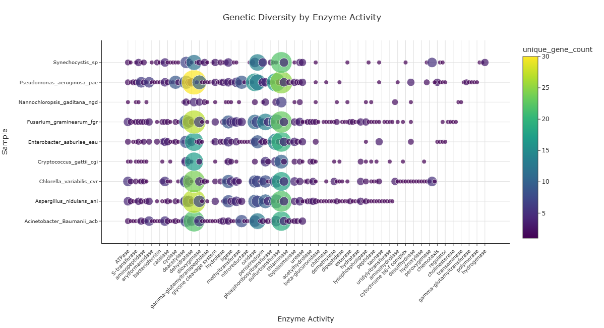
Interpretation and Key Messages
- Gene Annotation Hotspots
-
Large, bright bubbles may mark hotspots of high gene annotation diversity:
- the corresponding sample has many different gene annotations supporting that specific enzymatic function in the dataset.
-
Sample-Level Enzymatic Annotation Profiles
-
Reading across a row (fixed sample, varying enzyme activities) may reveal the enzymatic annotation profile of that sample:
- a row with many large bubbles may indicate broad gene annotation coverage across many enzymatic activities,
- a row with only a few large bubbles could indicate concentrated annotation coverage in specific enzymatic functions.
-
Function-Level Annotation Distribution
-
Reading down a column (fixed enzyme activity, varying samples) may reveal how gene annotations for that activity are distributed across samples:
- a column with large bubbles in many samples may indicate a widely annotated enzymatic function across the dataset,
- a column with one or few bubbles may indicate a narrowly annotated activity restricted to specific samples.
-
Annotation-guided Comparative Analysis
- Comparing samples with different annotation "hotspot" profiles can support annotation-based hypothesis generation (experimental validation required to confirm functional roles).
Reproducibility and Assumptions
- Input Format Requirements
-
The analysis assumes a semicolon-delimited file with at least:
sample,enzyme_activity,genesymbol.
-
Counting Rules
- Genetic diversity is defined as the number of unique gene symbols per
(sample, enzyme_activity)pair. -
Multiple rows representing the same
genesymbolfor the same sample and activity do not increase the count. -
Scope and Limitations
- The plot reflects annotated gene diversity per enzymatic function, not measured expression levels or kinetic parameters.
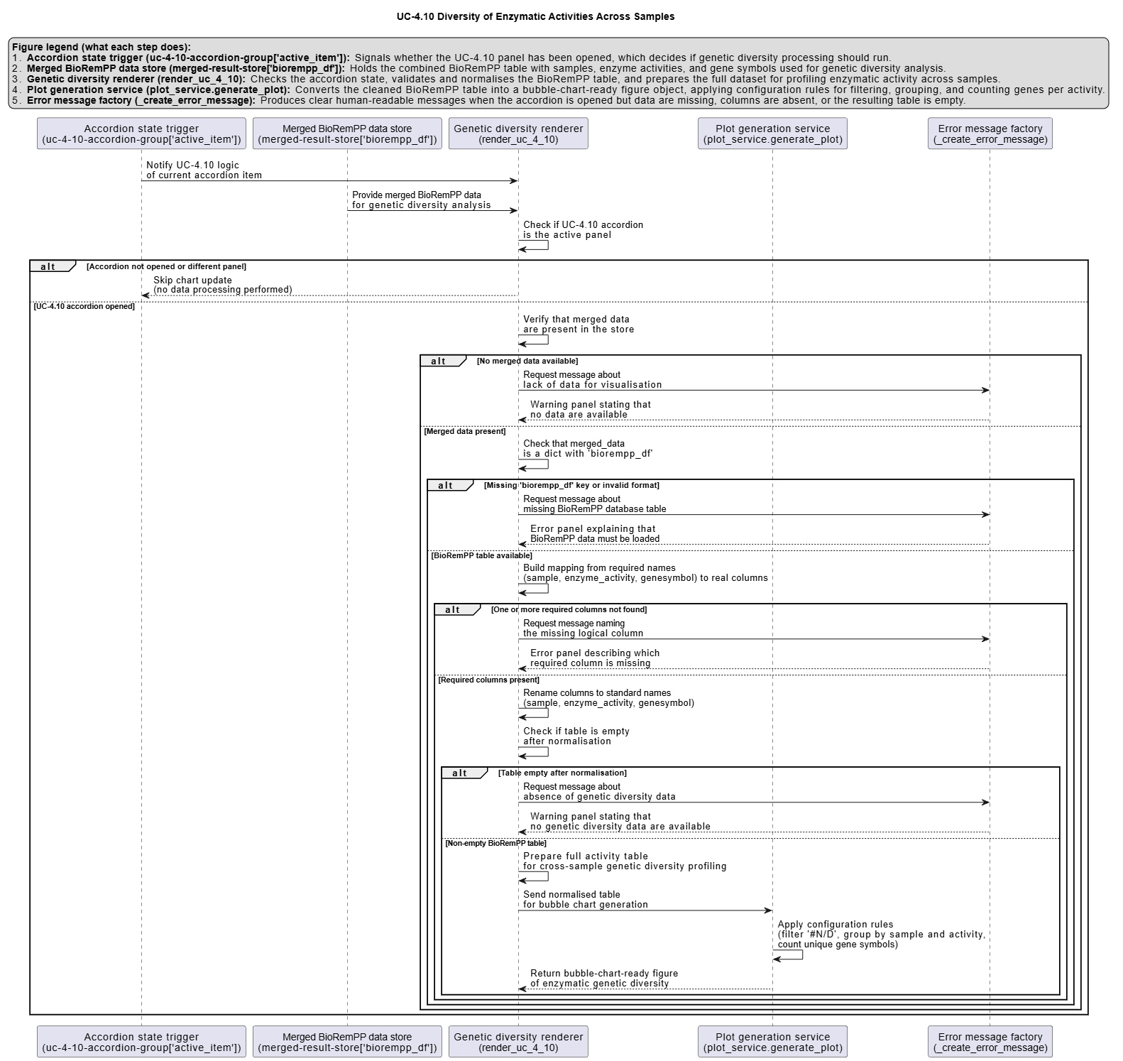
Activity diagram of the use case
Click on the image to enlarge and explore details.