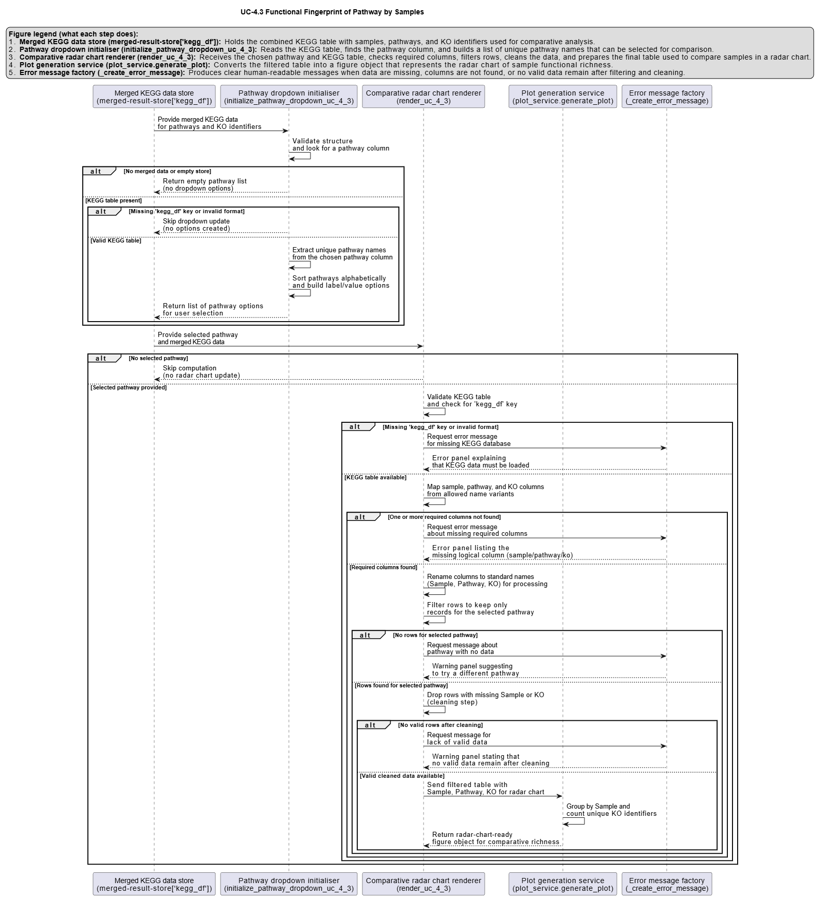
UC-4.3 — Functional Fingerprint of Pathway by Samples
Module: 4 – Functional and Genetic Profiling
Visualization type: Interactive radar (polar) plot (sample-level KO richness for a selected pathway)
Primary inputs: KEGG_Results.xlsx or KEGG_Results.csv (sample–KO–KEGG pathway associations)
Primary outputs: Polar "functional footprint" of a selected pathway across all samples
Scientific Question and Rationale
Question: For a given metabolic pathway, what is the relative KO annotation richness of each sample, and which samples have the most extensive KO annotations?
This use case focuses on a pathway-centric view: for a selected KEGG pathway, it compares all samples simultaneously in terms of the number of unique KEGG Orthology (KO) identifiers annotated for that pathway in each sample.
Instead of a Cartesian bar chart, the analysis uses a radar (polar) plot to provide an intuitive, shape-based representation of the KO annotation distribution of a pathway across the entire panel of samples. This can enable rapid visual identification of:
- samples with high KO annotation richness for that pathway, and
- balanced vs. skewed distributions of KO annotations across samples.
Data and Inputs
- Primary data source:
KEGG_Results.xlsx or KEGG_Results.csv(semicolon-delimited) - Key columns:
sample– identifier for each biological samplepathname– KEGG pathway name or identifier-
ko– KEGG Orthology (KO) identifier associated with that sample and pathway -
User control:
-
A dropdown menu for selecting a single metabolic pathway (
pathname) to analyze. -
Output structure:
- Axes (θ): one axis per
sample, arranged around the circle - Radius ®: for each axis, the unique KO count for the selected pathway in that sample
- Polygon: a closed shape connecting all sample points, representing the pathway's distribution of functional richness across the consortium
Analytical Workflow
- Pathway Selection (User Input)
The user selects a metabolic pathway from an interactive dropdown menu. -
This selection corresponds internally to a specific
pathnamevalue. -
Dynamic Filtering
- The KEGG results table
KEGG_Results.xlsx or KEGG_Results.csvis loaded. -
The dataset is filtered to retain only rows where:
pathnamematches the selected pathway, andsampleandkoare valid and non-missing.
-
Aggregation of KO Richness per Sample
- The filtered data is grouped by
sample. - For each sample, the number of distinct KO identifiers is computed (e.g., via
nunique()onko). -
This yields a vector of
(sample, unique_ko_count)values describing pathway-specific KO richness for each sample. -
Rendering as Radar (Polar) Plot
- Each sample is mapped to an angular coordinate (θ) around the circle.
- The corresponding radius ® for each sample is the unique KO count.
- A closed polygon is drawn by connecting the points in order, optionally with markers at each vertex:
- axes: samples
- radius: pathway-specific KO richness
How to Read the Plot
- Dropdown Menu (Pathway Selection)
- Use the menu to select the Metabolic Pathway of interest.
-
The radar plot recomputes and updates automatically for the chosen pathway.
-
Axes (θ – Samples)
- Each radial axis emanating from the center corresponds to one Sample.
-
All samples involved in the selected pathway are arranged around the circle.
-
Radius (r – KO Richness)
- The distance from the center along a given axis represents the count of unique KOs that sample contributes to the selected pathway.
-
Larger radius values indicate greater pathway-specific KO richness.
-
Polygon Shape (KO Annotation Distribution)
- The polygon connecting all sample points encodes the overall distribution of KO annotation richness for that pathway across samples:
- a symmetrical, evenly expanded shape may indicate more balanced KO annotation coverage
- a skewed shape stretched towards one or a few axes may highlight samples with particularly high KO annotation richness for that pathway
Representative Output
The image below illustrates a representative output generated by this use case using the example dataset.
Click on the image to enlarge and explore details.
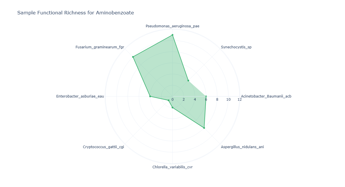
Interpretation and Key Messages
- Samples with High KO Annotation Richness
- Points further from the center on a given axis may represent higher KO annotation richness for that sample in the selected pathway.
-
These high-radius samples could be annotation-level candidates for prioritized experimental investigation of that pathway (experimental validation required to confirm functional roles).
-
Identifying Samples with Concentrated KO Annotations
- If the radar polygon is heavily skewed towards particular axes, it may indicate that a small subset of samples carries most of the KO annotations for the selected pathway.
-
Such samples may be worth examining as starting points for annotation-guided experimental design.
-
How KO Annotation Patterns Shift Across Pathways
-
By switching between different pathways via the dropdown, users can observe how KO annotation distributions shift from one pathway to another.
-
Distributed vs. Concentrated KO Annotations
- A radar plot where several axes reach similar radii may suggest a pathway whose KO annotations are broadly distributed across samples, potentially indicating annotation-level redundancy.
- Conversely, a plot where only one or two axes reach high values may suggest that the pathway's KO annotations are concentrated in few samples, which may be worth noting for annotation-guided hypothesis generation.
Reproducibility and Assumptions
- Input Format
The analysis requires a semicolon-delimited KEGG results table with at least: sample,pathname,-
ko. -
Definition of Pathway Richness
- For each sample, pathway richness is defined as the count of unique KOs annotated to the selected pathway.
-
Multiple occurrences of the same
(sample, pathname, ko)combination do not increase the count. -
Scope and Limitations
- The metric reflects KO annotation presence, not expression levels, regulatory control, or actual metabolic flux.
- Radar plots are most interpretable when the number of samples (axes) is moderate; very large sample sets may require pre-filtering or grouping for clarity.
Activity diagram of the use case
Click on the image to enlarge and explore details.