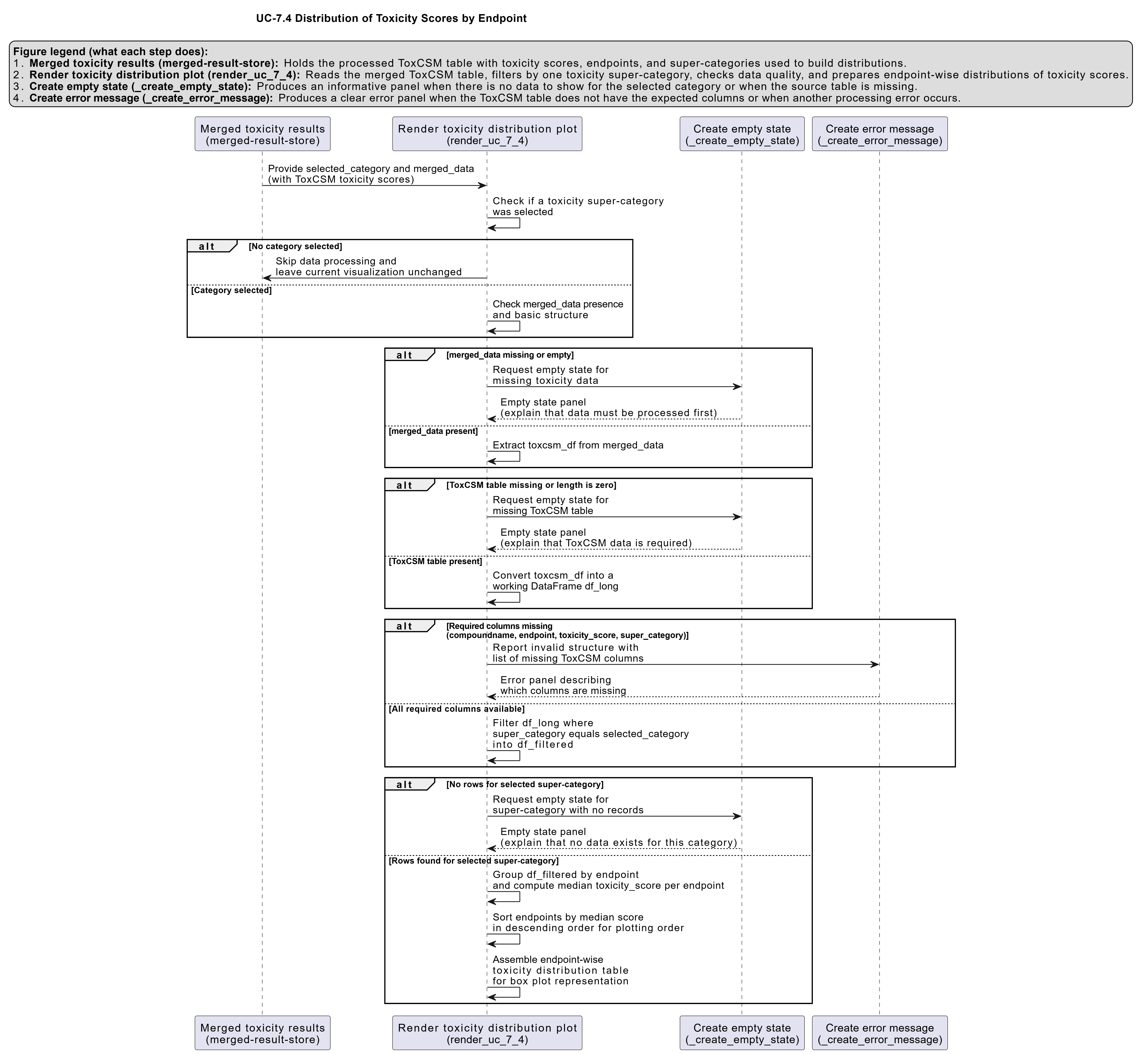
UC-7.4 — Distribution of Toxicity Scores by Endpoint
Module: 7 – Toxicological Risk Assessment and Profiling
Visualization type: Interactive box plot panel (toxicity score distributions by endpoint)
Primary inputs: ToxCSM.xlsx or ToxCSM.csv with value_ toxicity score columns and associated endpoint labels
Primary outputs: Per-endpoint distribution of predicted toxicity scores within a selected super-category
Scientific Question and Rationale
Question: Within a broad toxicological domain (e.g., Genomic Toxicity), what is the statistical distribution of predicted toxicity scores across its specific endpoints, and which endpoints exhibit the highest median risk or greatest variability?
This use case provides a detailed, endpoint-level view of the predicted toxicity landscape derived from the ToxCSM model. Rather than focusing on individual compounds or biological samples, the emphasis here is on comparing toxicity endpoints within a high-level domain. By visualizing each endpoint as a box plot, the analysis may reveal which tests or prediction targets are consistently high risk, which show broad variability, and where extreme outlier compounds occur. This information can guide prioritization of endpoints and support interpretation of compound-level risk patterns used elsewhere in BioRemPP.
Data and Inputs
- Primary data source:
ToxCSM.xlsx or ToxCSM.csv(semicolon-delimited) - Key columns and structure:
compoundname– name of the chemical compoundvalue_*– numeric toxicity scores for specific endpoints (e.g.,value_Gen_Carcinogenesis)- associated metadata linking each
value_*column to:- a toxicological endpoint (e.g.,
Gen_Carcinogenesis,Env_Biodegradation) - a super-category (e.g.,
Gen→ Genomic,Env→ Environmental)
- a toxicological endpoint (e.g.,
- Toxicity super-categories (prefixes):
NR– Nuclear ResponseSR– Stress ResponseGen– GenomicEnv– EnvironmentalOrg– Organic
Analytical Workflow
-
User Selection
The user selects a broad toxicity category (e.g., "Genomic") from an interactive dropdown menu. Internally, this corresponds to one of the super-category prefixes (e.g.,Gen). -
Data Transformation (Melting to Long Format)
The wide-formatToxCSM.xlsx or ToxCSM.csvtable, which contains manyvalue_columns, is reshaped into a long format: - each row corresponds to a single
(compoundname, endpoint)pair, - with a single numeric toxicity score in a column such as
tox_score, and -
an
endpointlabel (e.g.,Gen_Carcinogenesis). -
Dynamic Filtering by Super-Category
The long-format data is filtered to retain only rows whose endpoint belongs to the user-selected Toxicity Super-Category (e.g., allGen_*endpoints when "Genomic" is selected). -
Rendering
The filtered scores are rendered as a set of side-by-side box plots, where: - each box plot corresponds to one specific Toxicological Endpoint within the selected category, and
- all compounds with a score for that endpoint contribute to its distribution.
Individual data points (compound-level scores) may be shown as jittered or overlaid points to illustrate dispersion and outliers.
How to Read the Plot
-
Dropdown Menu
Use the dropdown to select the Toxicity Super-Category (e.g., Genomic, Environmental). The panel of box plots will update to reflect endpoints belonging only to the chosen category. -
X-axis (Endpoints)
Represents individual Toxicological Endpoints within the selected super-category (e.g.,Gen_Carcinogenesis,Gen_AMES_Mutagenesis). -
Y-axis (Toxicity Score)
Represents the predicted Toxicity Score (typically normalized, e.g., from 0 = low risk to 1 = high risk). -
Box Plot Elements
Each box plot summarizes the distribution of scores for one endpoint: - the median value is shown as a horizontal line inside the box,
- the box itself represents the interquartile range (IQR), containing the central 50% of scores,
-
whiskers and points outside the box indicate the spread and potential outliers.
-
Points (Optional Overlay)
Individual points correspond to the toxicity scores of specific compounds for that endpoint, providing a more granular view of the distribution.
Representative Output
The image below illustrates a representative output generated by this use case using the example dataset.
Click on the image to enlarge and explore details.
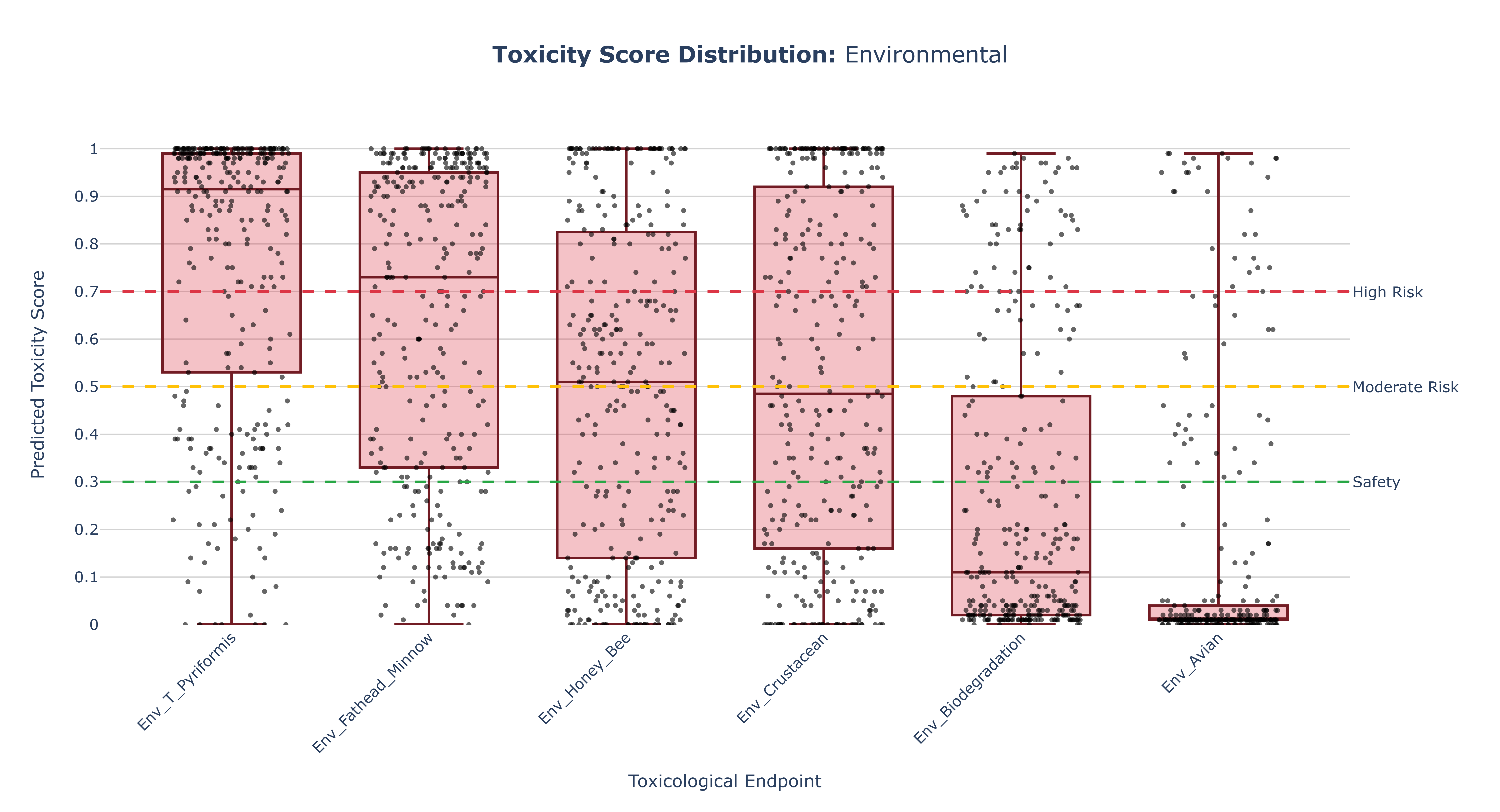
Interpretation and Key Messages
-
Identifying High-Risk Endpoints
Endpoints whose box plots are positioned higher on the y-axis (i.e., with higher medians) may represent areas of greater overall predicted toxicological concern. These endpoints could warrant increased attention when interpreting compound-level risk in subsequent analyses. -
Assessing Variability
The height of each box (IQR) and the length of its whiskers reflect how variable the predictions are: - a tall box may indicate a wide spread of toxicity scores across compounds, suggesting heterogeneous risk within that endpoint,
-
a short box may suggest that most compounds behave similarly, with relatively homogeneous predicted risk.
-
Spotting Potent Compounds
Individual points that appear as high outliers correspond to compounds with exceptionally high predicted toxicity for that endpoint. These compounds could be prime candidates for: - prioritized investigation in downstream modules, and/or
-
deeper experimental validation.
-
Comparative Toxicology Across Endpoints
By visually comparing box plots within a super-category, users can quickly answer questions such as: - "Are carcinogenesis-related scores generally higher than mutagenesis-related scores in the Genomic category?"
- "Which Environmental endpoints show the largest variability in predicted toxicity?"
Reproducibility and Assumptions
-
Input Format
The analysis assumes a semicolon-delimitedToxCSM.xlsx or ToxCSM.csvtable, withvalue_columns whose names or prefixes map unambiguously to the five super-categories (NR, SR, Gen, Env, Org). -
Data Handling
The visualization directly plots the raw predicted toxicity scores from ToxCSM without additional normalization beyond any scaling inherent to the model. -
Endpoint Mapping
Endpoints are grouped into super-categories using a predefined mapping based on column prefixes or metadata. Adjusting this mapping will change which endpoints appear under each dropdown choice but will not alter the underlying scores. -
Model Dependency
The box plots represent statistical summaries of model predictions, not measured experimental toxicity. Interpretation should consider: - potential model biases, and
- the intended context of the ToxCSM predictions (e.g., ranking, screening, or approximate risk estimation).
Activity diagram of the use case
Click on the image to enlarge and explore details.