UC-7.5 — Probability Distributions of Toxicity Scores by Endpoint
Module: 7 – Toxicological Risk Assessment and Profiling
Visualization type: Interactive overlaid kernel density estimate (KDE) curves
Primary inputs: ToxCSM.xlsx or ToxCSM.csv with value_ toxicity score columns and associated endpoint labels
Primary outputs: Endpoint-specific probability density curves of predicted toxicity scores within a selected super-category
Scientific Question and Rationale
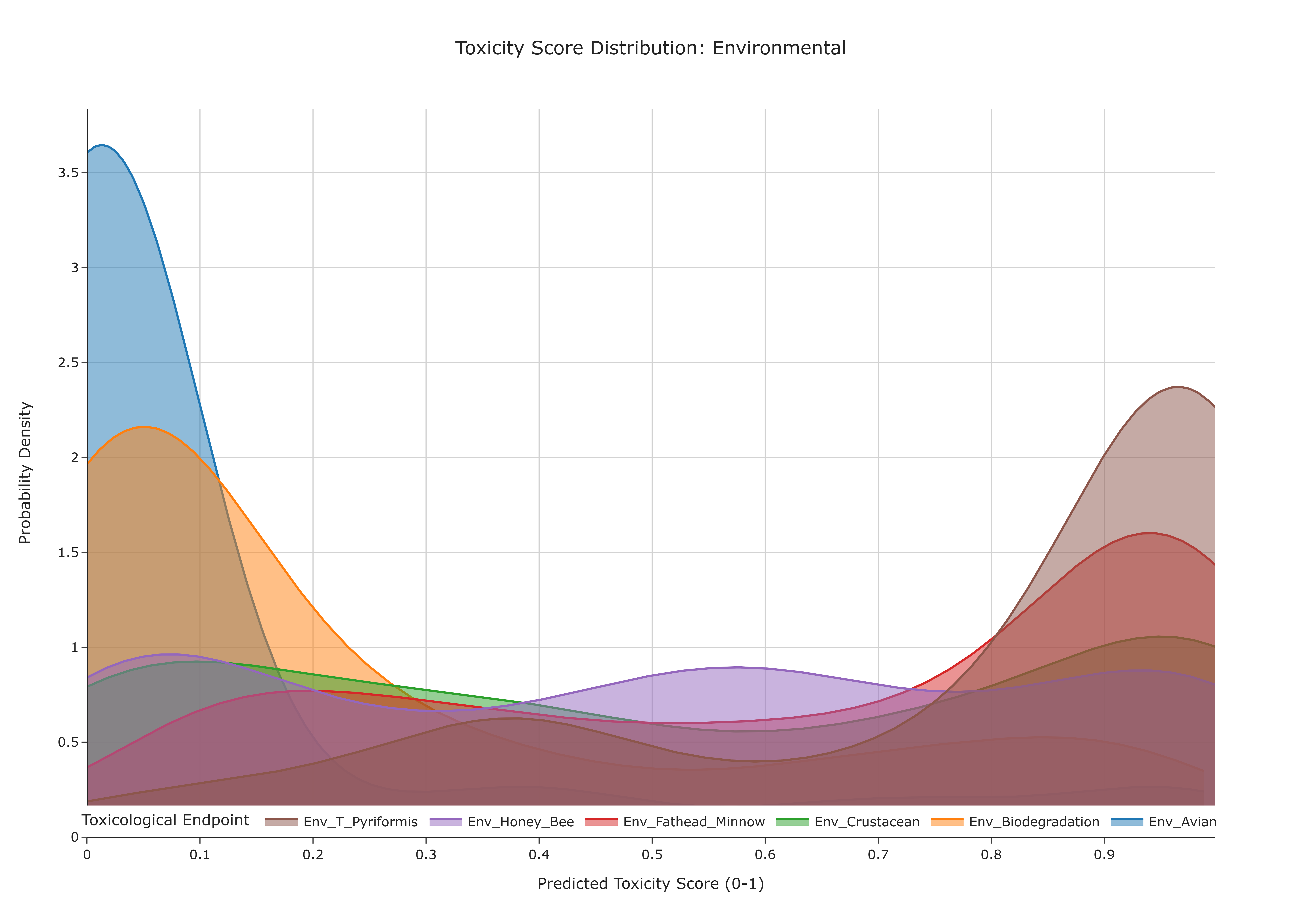
Question: Within a broad toxicological domain (e.g., Genomic Toxicity), what are the probability distributions of predicted toxicity scores across its specific endpoints, and which endpoints exhibit the highest median risk or greatest variability?
This use case complements the box-plot–based summary (UC-7.4) by providing a continuous, distribution-level view of the predicted toxicity scores from the ToxCSM dataset. Instead of summarizing each endpoint using quartiles alone, overlaid kernel density estimate (KDE) curves are used to approximate the probability density of scores for each toxicological endpoint in a given super-category. This allows direct comparison of the shape, central tendency, and spread of the distributions, which can help identify endpoints with systematically higher risk, tighter consensus, or greater uncertainty.
Data and Inputs
- Primary data source:
ToxCSM.xlsx or ToxCSM.csv(semicolon-delimited) - Key columns and structure:
compoundname– name of the chemical compoundvalue_*– numeric toxicity scores for specific endpoints (e.g.,value_Gen_Carcinogenesis)- metadata mapping each
value_*column to:- a Toxicological Endpoint (e.g.,
Gen_Carcinogenesis,Env_Biodegradation) - a Super-category (e.g., Genomic, Environmental)
- a Toxicological Endpoint (e.g.,
- Toxicity super-categories (prefixes):
NR– Nuclear ResponseSR– Stress ResponseGen– GenomicEnv– EnvironmentalOrg– Organic
Although this visualization is compound-centric, it indirectly informs how different classes of compounds present in the dataset are distributed in terms of predicted toxicological risk.
Analytical Workflow
-
User Selection
The user selects a Toxicity Super-Category (e.g., "Genomic") from an interactive dropdown menu. Internally, this corresponds to a subset ofvalue_*columns (e.g., all prefixed withGen_). -
Data Transformation (Melting to Long Format)
The wide-formatToxCSM.xlsx or ToxCSM.csvtable, which contains multiplevalue_columns, is reshaped into a long format: - each row corresponds to a single
(compoundname, endpoint)pair, - with a single numeric toxicity score in a column such as
tox_score, and -
an
endpointlabel identifying the specific toxicological test or prediction. -
Dynamic Filtering by Super-Category
The long-format data is filtered to retain only those rows whose endpoints belong to the selected super-category. For example, when "Genomic" is selected, only endpoints with prefixGen_are kept. -
Density Estimation and Rendering
For each endpoint within the selected category: - the distribution of its
tox_scorevalues across compounds is used to compute a kernel density estimate (KDE), - the resulting smoothed density curve is plotted on a shared axis.
All endpoint-specific KDE curves are overlaid on a single plot, typically with semi-transparent colors and a legend linking each color to its endpoint.
How to Read the Plot
-
Dropdown Menu
Use the dropdown to choose the Toxicity Super-Category (e.g., Genomic, Environmental). The set of overlaid density curves will update accordingly to show endpoints only from the selected category. -
X-axis (Toxicity Score)
Represents the predicted Toxicity Score (e.g., from 0 = low risk to 1 = high risk). -
Y-axis (Probability Density)
Represents the estimated probability density. For each endpoint's curve, the area under the curve integrates to 1. -
Overlaid Curves
Each colored, semi-transparent curve corresponds to one Toxicological Endpoint: - the position of the peak indicates where scores are most concentrated,
- the width of the curve reflects how widely scores are spread,
- the legend links each color to its endpoint (e.g.,
Gen_Carcinogenesis,Gen_AMES_Mutagenesis).
Representative Output
The image below illustrates a representative output generated by this use case using the example dataset.
Click on the image to enlarge and explore details.
Interpretation and Key Messages
-
Identifying High-Risk Endpoints
Endpoints whose KDE curves have peaks shifted toward the right (closer to 1.0) correspond to tests where high toxicity scores are more frequent. These endpoints may represent areas of heightened toxicological concern within the selected super-category. -
Assessing Consensus vs. Variability
- A tall, narrow peak may indicate a strong consensus: most compounds yield similar scores (low variability).
-
A short, broad curve may indicate high variability: scores are widely distributed, suggesting more heterogeneous toxicological behavior.
-
Comparative Toxicology
By visually comparing the shapes and positions of the curves, users can quickly: - identify endpoints that are systematically more severe (densities concentrated at higher scores),
- distinguish stable endpoints (narrow, well-localized distributions) from uncertain ones (broad distributions), and
-
infer which toxicity dimensions may dominate the overall risk profile in the selected domain.
-
Contextualizing Endpoint Risk for Downstream Analyses While this visualization does not directly include biological samples, it can inform:
- which toxic endpoints are most prominent in the dataset, and
- which endpoints may warrant closer attention in subsequent annotation-level analyses.
Reproducibility and Assumptions
- Input Format
The analysis assumes a semicolon-delimitedToxCSM.xlsx or ToxCSM.csvtable that: - contains
value_columns for each endpoint, and -
uses prefixes (NR, SR, Gen, Env, Org) or equivalent metadata to map endpoints to super-categories.
-
Data Handling
The KDE curves are computed directly from the raw predicted toxicity scores: - no additional normalization is applied beyond what is inherent to ToxCSM,
-
the choice of kernel and bandwidth controls the smoothness of each curve but does not alter the underlying data distribution.
-
Endpoint–Category Mapping
Correct grouping of endpoints into super-categories depends on a predefined mapping. Modifying this mapping will change which endpoints appear together but will not change each endpoint's internal distribution. -
Model Dependency
As with UC-7.4, the curves represent model predictions, not experimental measurements. Interpretation should consider: - potential biases or limitations of the ToxCSM model, and
- the intended use of these predictions (e.g., for ranking, screening, or initial risk stratification).
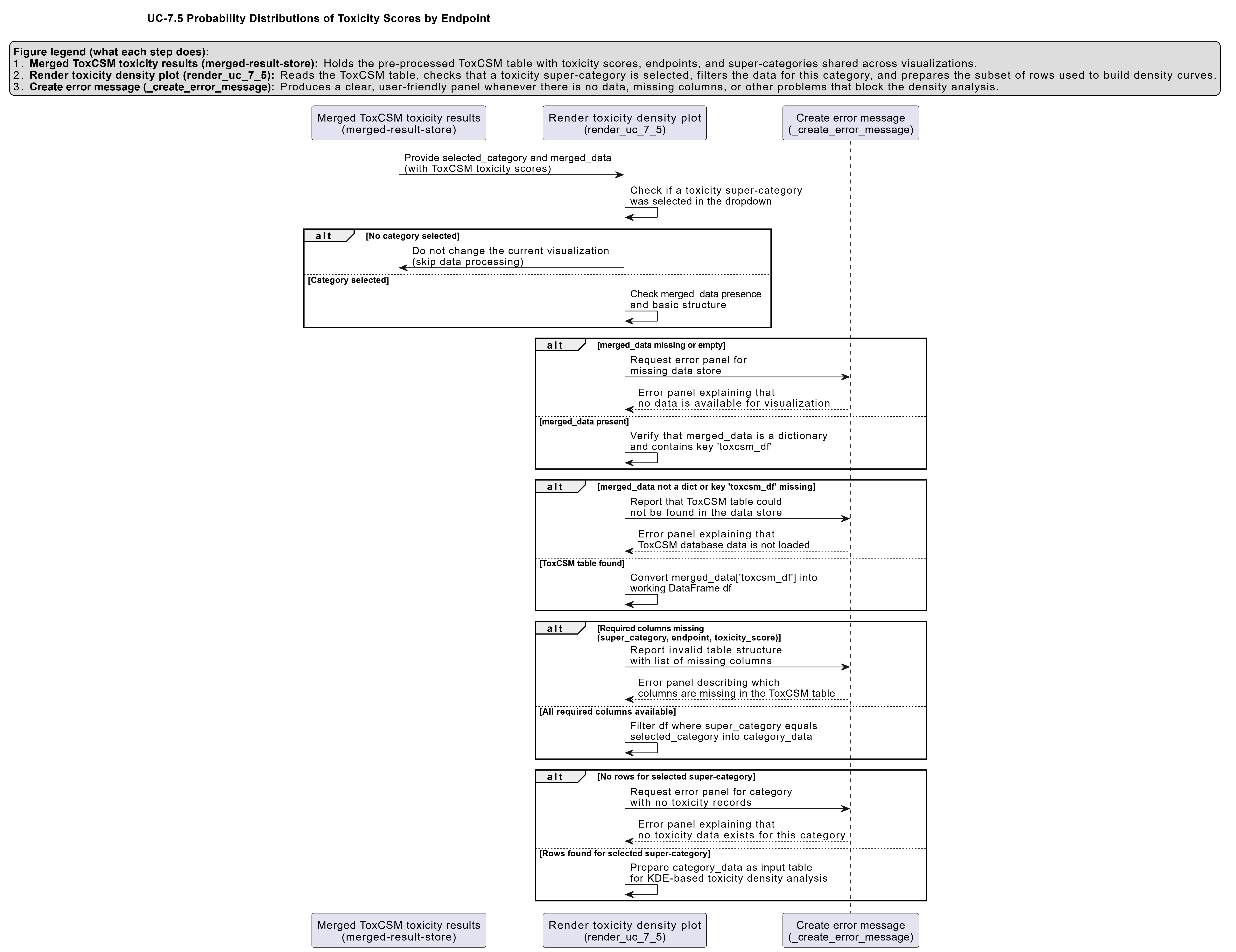
Activity diagram of the use case
Click on the image to enlarge and explore details.